


What is a Candlestick Chart?
Chinese Name: K-line Chart
Foreign Name: Candlestick Chart
Alias: Yin-Yang Line, Candle Chart
Advantage: Provides a complete, comprehensive, and thorough observation of market changes

Origin: 19th century, during Japan's Tokugawa Shogunate period
Candlestick charts originated in Japan during the Tokugawa Shogunate era, where merchants used them to record rice market trends and price fluctuations. Later, due to their simplicity, convenience, and unique graphical method, they were adopted in financial markets such as stocks and futures.
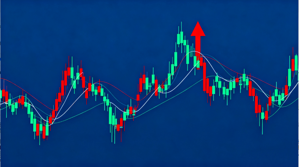
The chart resembles a series of candles, which can be either black or white, hence the name "Yin-Yang Chart."
By plotting candlestick charts, daily or periodic price movements can be recorded, forming various patterns and regions on the graph. Observers can identify certain patterns from these changes, aiding in predicting future trends.
A candlestick chart consists of a real body, upper shadow (wick), and lower shadow (wick), representing the opening, closing, highest, and lowest prices. Based on the calculation method, candlestick charts can be categorized into daily, weekly, monthly, quarterly, and yearly charts.
**Drawing Method:**
1. Identify the highest and lowest prices for the day or period and connect them with a vertical line.
2. Locate the opening and closing prices and form a rectangular body between them.
- If the closing price is higher than the opening price, the body is colored red (called a "Yang line").
- If the closing price is lower than the opening price, the body is colored green (called a "Yin line").
**Weekly Candlestick Chart:** Uses Monday's opening price, Friday's closing price, and the week's highest and lowest prices.
**Monthly Candlestick Chart:** Uses the first trading day's opening price, the last trading day's closing price, and the month's highest and lowest prices.
**Usage of Candlestick Charts:**
- Daily charts: Analyze short-term trends.
- Weekly charts: Analyze medium-term trends.
- Monthly charts: Analyze long-term trends.
**Three Types of Trends:**
1. **Uptrend:** Resembles climbing uphill or stairs with an upward slope.
2. **Downtrend:** Resembles going downhill or descending stairs with a downward slope.
3. **Sideways Trend (Consolidation):** Fluctuates within a certain range or period.