How to Read the Trend Chart
The real-time market trend chart, also known as the intraday trend chart, displays the following key elements:
-
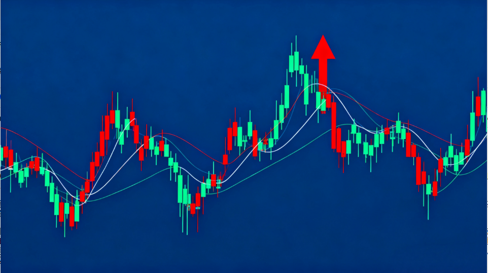
Red and Green Bars
-
These bars reflect the strength of index movements (up or down).
-
Red bars appear above the baseline when the market rises. More and taller red bars indicate stronger upward momentum; shrinking bars suggest weakening buying pressure.
-
Green bars appear below the baseline when the market falls. More and longer green bars indicate stronger downward momentum; shortening bars suggest easing selling pressure.
-
-
Thick Horizontal Line
-
Represents the previous trading day’s closing index level.
-
Acts as a divider:
-
Above the line = Market is in an upward zone.
-
Below the line = Market is in a downward zone.
-
-
-
White Curve and Yellow Curve
-
White Curve: The weighted market index (official SSE Index, accounting for market capitalization).
-
Yellow Curve: The unweighted index (all stocks equally impact the index, regardless of share issuance volume).
Interpreting the curves:
-
During an uptrend:
-
If the yellow curve is above the white curve, small-cap stocks (low issuance volume) are outperforming.
-
If the yellow curve is below the white curve, large-cap stocks (weighted shares) are leading the rally.
-
-
During a downtrend:
-
If the yellow curve stays above the white curve, small-cap stocks are declining less than large-caps.
-
If the white curve exceeds the yellow curve, small-caps are falling more sharply.
-
-
-
Yellow Volume Bars
-
Show trading volume per minute (in lots).
-
The leftmost extended bar represents auction volume; subsequent bars update every minute.
-
Longer bars = Higher trading volume; shorter bars = Lower volume.
-
-
Display Box
-
Shows numbers or letters (e.g., entering stock code 600602 for "Vacuum Electron" displays the corresponding digits).
-
-
Red and Green Boxes
-
Red box = Buying pressure; Green box = Selling pressure.
-
A longer red box signals stronger buying interest, pushing the index upward.
-
A longer green box indicates heavier selling pressure, driving the index downward.
-


